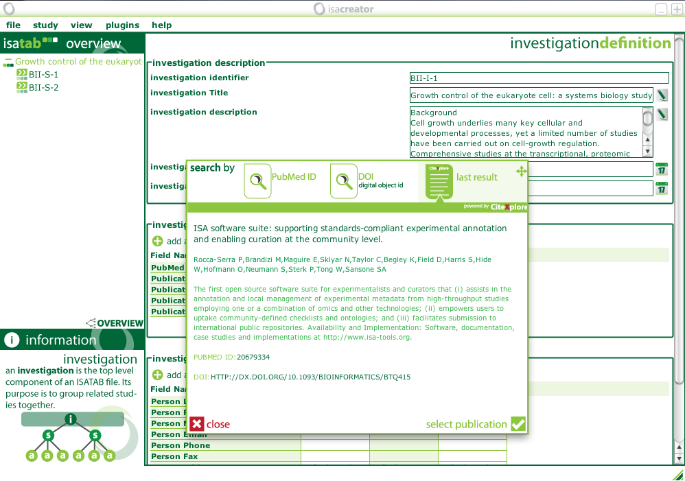
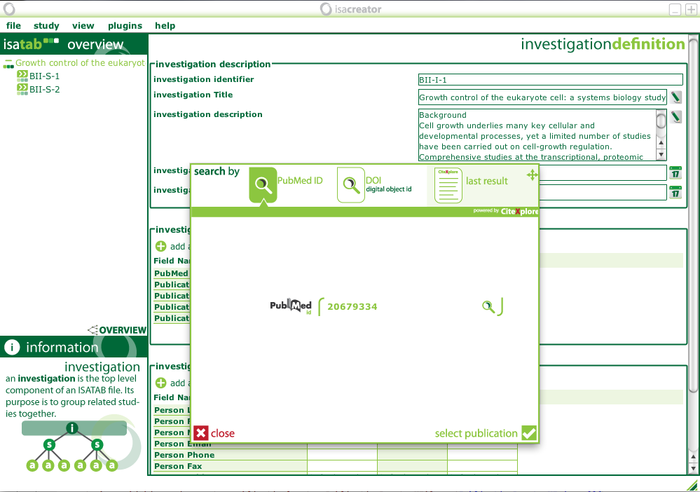
I’ve never really liked the Publication locator utilities user interface much, so whilst at BioCurator, in the spare time I had, I redid the interface to make it clearer, faster and more informative to users. The result of the improvements are shown in the screenshots below!

Publication information is now clearer, and you can easily access a previous search via the last result button in the top panel.
I might make some more improvements to the UI in the next few hours, but for now I think it’s much better than it was!


