This is intended to be a constructive criticism of a resource which I believe to have the potential to be powerful and useful.
Any of you who have read Edward Tufte’s essay on Visual and Statistical Thinking: Displays of Evidence for Making Decisions will instantly recognise this question…compared to what? We see many examples in the biological world, and I’ll focus specifically on one resource here…the ArrayExpress Atlas. First, a disclaimer: I used to work in the group who developed this resource, and have aired my criticisms many years ago to no avail. And not only me, senior researchers have raised the same questions even before the resource was developed, but all suggestions have up to now been ignored.
Here, I will only give food for thought about what is presented in the Atlas since some people don’t seem to understand that what is presented doesn’t actually make much sense. This is mostly caused by a failure to answer the compared to what question…a particularly important question for a resource which is comparing gene expression levels would you not say?
Some examples:
The heatmap
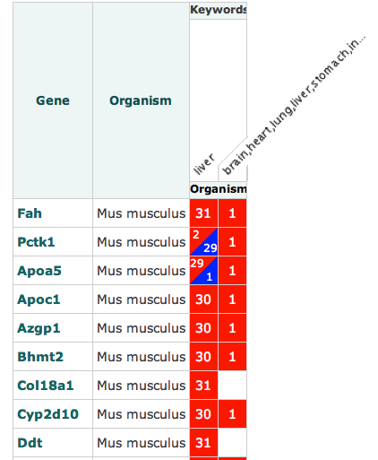
A query on the resource, such as this will yield a result like so:
My first thought would be that this heat map is telling me that Fah was up regulated in liver 31 times and once in some obscure string seemingly encompassing every organism in the human body (I’ll get to my criticism about these factor representations later). Now, the second question that any self-respecting investigator would ask is compared to what? Is this saying that it is up regulated compared to normal tissue, diseased tissue or all tissue across all organisms? Actually, we don’t know. And there is nothing to say what is being shown here. Moreover, what does it mean to say up and down regulated. Surely it depends. You can’t just present discrete variables, one needs to show the statistical meaning of such suggestions…i.e. show the P value of up/down regulations since not all may be meaningful to a biologist/statistician even though they may well be to guys in the ArrayExpress Atlas team.
Another small point on this is that if this value is dependent on database contents rather than baseline expression levels (whatever they are supposed to be), then if my database contains more liver samples than anything else, and expression levels are calculated relative to this content, my results will be skewed. Either a disclaimer should be presented on the site, or they should make the comparison metrics used more obvious.
The expression profiles & factor display
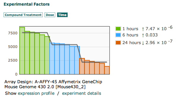
Based on this page.
 Look at this graph, and tell me what the Y-Axis represents. First of all, even if what they are trying to represent was meaningful, it would still be pretty useless. Let me explain. They have split up variables which are supposed to be related into 3 different tabs, with variables which make NO sense. What does it mean to show time as a variable. Time of what? Sampling time, the length of time an organism was exposed to a compound…what? Exactly, nothing. It means nothing to show time like this. What does it mean to show dose as a seemingly independent variable. Dosage is no good without a compound. What does make sense and can at least possibly allow one to ask the question “compared to what?” is to show growth factor beta 1 and 5 ng/ml after 1 hour as one factor, and show the expression levels then (even though we still don’t know what the Y axis means). You can look at any experiment in the Atlas and find the same problems.
The cluster effect
All people, even those not in the realm of statistics need to understand the importance of the cluster effect. I.e. do I only get over expression of one or more genes when another gene is expressed/under expressed. Transcription networks are indeed networks. There are feedback loops, both positive and negative, and a lot is known about these loops already. So, why are these not taken into account when calculating statistics in the Atlas? For such cases, presenting mutually exclusive P-values of individual genes is not really enough and the clustering effects should be taken into account more so as to adjust the P-value to more realistic sizes.
Summary
I have presented my thoughts on the ArrayExpress Atlas publicly and internally beforehand, but this is the first time I’m airing it to the public domain. I hope now that something is done to fix this resource since I still believe it to have the potential to be cool and really helpful.


